
Work in progress
This page aims to have an overview of basic knowledge about data analysis and how we should apprehend a dataset. Which tools can we use to have a better insight of our data?
1. Data
quantitative data : variables which are made of numerical values. Values could be continuous or discrete.
Ex1 : temperature is a continuous quantitative variable
|
1 2 3 |
temperatures=[20,18.7,-3.4,32,0,3,-10.8] >>>temperatures [20,18.7,-3.4,32,0,3,-10.8] |
Ex2 : number of kids in a family is a discrete quantitative variable
|
1 2 3 |
kids_qty=[2,0,4,1,1,0,3] >>>kids_qty [2,0,4,1,1,0,3] |
qualitative data : they represent categories. Labeling can be done using text or numerical values. A qualitative variable can be ordinal or nominal. We say it’s an ordinal variable if ordering these values have a meaning.
Ex3 : locations (eg countries) are nominal qualitative values
|
1 2 3 |
locations=["USA","France","Thailand","Argentina","France","France","USA"] >>>locations ["USA","France","Thailand","Argentina","France","France","USA"] |
Ex4 : segment of a market can be ordinal values
|
1 2 3 |
market_value_segment=["big","small","medium","big","medium","medium","small"] >>>market_value_segment ["big","small","medium","big","medium","medium","small"] |
dates, times
different format can be found in dataset. Here is a description of some usual format and some tools to manipulate it in python.
|
1 2 3 4 5 6 7 8 9 10 11 12 13 14 15 16 17 18 19 20 21 22 23 24 25 26 27 28 29 30 31 32 33 34 35 36 37 38 39 40 41 42 43 44 45 46 47 48 |
import time import datetime import pandas as pd #time timestamp=time.time() #unix epoch : number of second since 1st January 1970 at 00:00:00 time.localtime() #datetime now=datetime.datetime.now() print(now.year) print(now.month) print(now.day) print(now.hour) print(now.minute) print(now.second) print(now.isoformat()) #pandas time range and timestamp operation timerange=pd. date_range('6-21-2018',periods=20,freq='D') timerange #time range have frequencies #DatetimeIndex(['2018-06-21', '2018-06-22', '2018-06-23', '2018-06-24', # '2018-06-25', '2018-06-26', '2018-06-27', '2018-06-28', # '2018-06-29', '2018-06-30', '2018-07-01', '2018-07-02', # '2018-07-03', '2018-07-04', '2018-07-05', '2018-07-06', # '2018-07-07', '2018-07-08', '2018-07-09', '2018-07-10'], # dtype='datetime64[ns]', freq='D') timestamp=pd.Timestamp('2-23-2019 14:17:45.5') timedelta=pd.Timedelta('1 day') timeperiod=pd.Period('2-23-2019') timeperiod.start_time timeperiod.end_time #converting to period and timestamp ts_dt.to_period() ts_pd.to_timestamp() #formating date #working with time zones from pytz import common_timezones,all_timezones t=timestamp.tz_localize(tz='US/Central') t=t.tz_convert('utc') #convert everything to utc time #read datetime properly with read_fwf |
Nothing fancy here, we just need to remember that several format for time can be found in dataset and that we shall have to translate everything to the same format for further analysis. Pandas library has great tool to test if a particular timestamp belongs to a period of time.
pictures (as bitmap arrays)
Pictures are arrays of pixels. In a grey scaled image, each pixel can be represented by a value between 0 (white) and 255 (black).

|
1 2 3 4 5 6 7 8 9 10 11 12 13 14 15 16 17 18 19 |
#load colored picture in a dataframe import numpy as np from PIL import Image image=Image.read('forest.jpg') image=np.asarray(image) #transform image in a numpy array image #array([[[123, 124, 30], # [124, 139, 0], # [126, 140, 1], # ..., # [ 89, 77, 25], # [ 83, 71, 21], # [ 87, 69, 29]], # ....... #we can check the shape of our array image.shape #returns (429,640,3) |

|
1 2 3 4 5 6 7 8 9 10 11 12 13 14 15 16 |
#load grey scaled picture in a dataframe image=Image.read('forest.jpg') image=np.asarray(image) image #array([[118, 125, 128, ..., 76, 70, 71], # [ 79, 106, 115, ..., 74, 69, 63], # [ 46, 78, 93, ..., 88, 88, 77], # ..., # [104, 107, 86, ..., 132, 139, 123], # [117, 121, 113, ..., 138, 138, 132], # [101, 94, 94, ..., 97, 91, 96]], dtype=uint8) #check shape of our array image.shape #returns (429,640) |
sounds (.wav format)
original map3 piano file : https://www.auboutdufil.com/get.php?web=https://archive.org/download/auboutdufil-archives/492/Myuu-TenderRemains.mp3
|
1 2 3 4 5 6 7 8 9 10 11 12 13 14 15 |
from scipy.io import wavefile fs, data=wavfile.read('piano.wav') fs #44100 data #array([[0, 0], # [0, 0], # [0, 0], # ..., # [0, 0], # [0, 0], # [0, 0]], dtype=int16) data.shape #(13100119,2) # 13100119 / 44100 = 297 s (which is the duration of our sound file) |
|
1 2 3 |
#sample of data sample=data[0:100000,:] plt.plot(sample) |
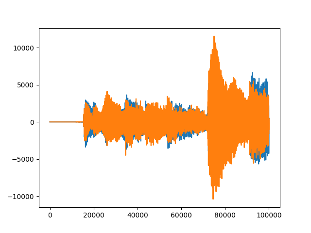
We can visualize the 2 channels (orange and blue) of the audio file. The discrete time is  second.
2. Distributions
For this study let’s group the variables we created in chapter 1 into a single pandas dataframe. All our lists contains the same amount of elements.
|
1 2 3 4 5 6 7 8 9 10 11 12 13 |
import pandas as pd import numpy as np data=pd.DataFrame(np.column_stack([temperatures,locations,kids_qty,market_value_segment]),columns=["temperature","locations","kids_qty","market_value"]) >>>data temperature locations kids_qty market_value 0 20.0 USA 2 big 1 18.7 France 0 small 2 -3.4 France 4 medium 3 32.0 Argentina 1 big 4 0.0 France 1 medium 5 3.0 USA 0 medium 6 -10.8 Thailand 3 small |
|
1 2 |
data.shape (7,4) |
data.shape returns the size of our data set, we have 7 individuals represented by 4 different features.
For each feature, let’s try to represent its distribution graphically.
a. Pie chart (qualitative data) : on locations column
|
1 2 3 4 5 6 7 |
import matplotlib.pyplot as plt #count the occurence for each label in locations location_count=data["locations"].value_counts() #plot associated piechart location_count.plot(kind='pie') plt.axis('equal') plt.show() |
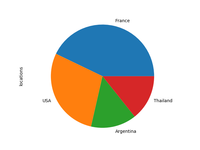
We can access the labels and values of our counts array using these commands :
|
1 2 3 4 5 6 7 |
location_count.index #returns #Index(['France', 'USA', 'Argentina', 'Thailand'], dtype='object') location_count.values #returns #array([3, 2, 1, 1]) |
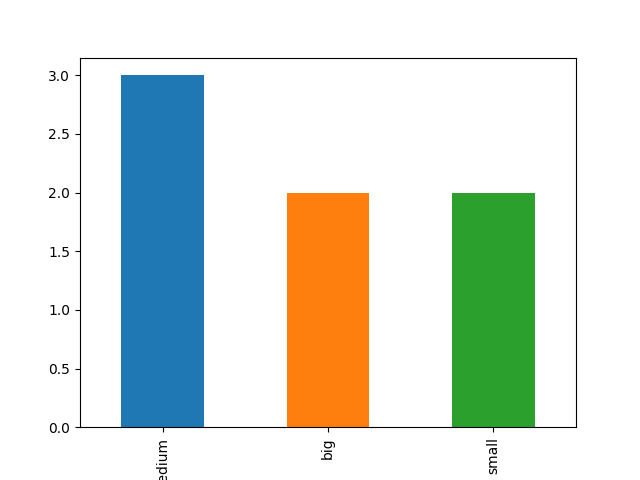
b. barchart (qualitative data) : on market_value column
|
1 2 3 4 5 |
#count occurences market_count=data["market_value"].value_counts() #plot it! market_count.plot(kind='bar') plt.show() |
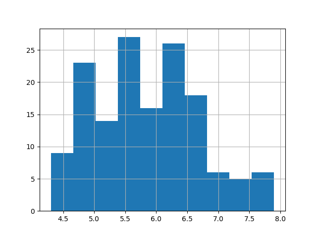
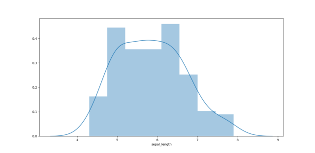
c. histogram (quantitative data) :
loading a bigger dataset for this chart (iris dataset see 6. Correlation)
|
1 2 3 |
#plot it! iris["sepal_length"].hist() plt.show() |
d. densities plot
|
1 2 |
import seaborn as sns sns.kdeplot(iris["sepal_length"],shade=True) |
3. Statistical inference
Statistical inference is the process of making conclusion about populations from data. One way to draw conclusion about a population is to observe a sample of it. We are using indicators to describe a variable (they are called estimators). Still, one has to be aware that summing up data with estimators must be done with care and that we should keep an eye on the distribution of our values. An estimator is said to be relevant if :
- it is consistant
- it has low bias and low variance
let’s review the most common estimators used in statistics.
a. mode
In a list, mode is the most represented value.
|
1 2 3 4 |
from statistics import mode mode(locations) #returns #'France' |
b. mean
mean a a variable is defined by :

|
1 2 3 |
np.mean(temperatures) #returns #8.500000000000002 |
c. median
median is the value that divide your variable in 2 groups with equal amount of individuals.
|
1 2 3 |
np.median(temperatures) #returns #3.0 |
d.variance and standard deviation

standard and variance are a measurement of dispersion.
|
1 2 3 4 5 6 7 8 9 |
#Variance np.var(temperatures) #returns #200.73428571428576 #Standard deviation np.std(temperatures) #returns #14.168072759351773 |
e. quantile, interquartile, decile, etc…
Q1 : value that cut the dataset with 1/4 of individuals under Q1 and 3/4 above Q1
Q3 : value that cut the dataset with 3/4 of individuals under Q3 and 1/4 above Q3
IQ interquartile distance : IQ = Q3 – Q1
|
1 2 3 4 5 6 7 8 9 10 11 12 |
#Q1 Q1=iris["sepal_length"].quantile(q=0.25) print(Q1) #5.1 #Q3 Q3=iris["sepal_length"].quantile(q=0.75) print(Q3) #6.4 #IQ IQ=Q3-Q1 print(IQ) #1.3 |
IQ is often use to remove outliers from our dataset (see outliers and missing values part).
f. range
Is the range of your variable. Difference between the minimum and the maximum value in your variable.
|
1 2 3 |
np.ptp(temperatures) #returns #42.8 |
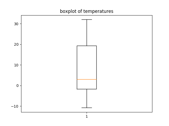
g. boxplot
A good representation a dataset and some of its statistics is the boxplot. On this chart we can read values associated to quantiles : median, Q1,Q3, Q1-1.5IQ, Q3+1.5IQ. Outliers are plotted as dots.
|
1 2 3 |
plt.boxplot(temperatures) plt.title('boxplot of temperature') plt.show() |
4. Skewness
Skewness is a measurement of symmetry (comparison of mode and mean).
|
1 2 3 4 |
#calculation of skewness skewness=data["temperature"].skew() #returns #0.384469564140117 |
3 cases :
skewness=0 : the distribution is symmetric
skewness<0 : the distribution is spreading more on the left of the mean value
skewness>0 : the distribution is spreading more on the right of the mean value
5. Kurtosis
Is a measurement of flatness of our distribution.
|
1 2 3 |
kurtosis=data["temperature"].kurtosis() #returns #-1.160628269697897 |
kurtosis is negative and low, which could represent quite a flat profile for our variable.
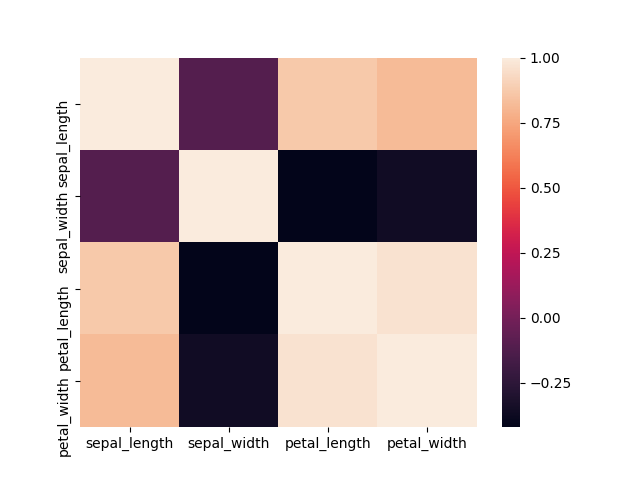
6. Correlations : bivariate analysis on quantitative variables
Correlation between 2 variable is a measure of how linearly dependent these 2 variables are. Iris data set is a famous dataset use in data science in order to understand the basic principles. I’ll use it to illustrate the correlation.

|
1 2 3 4 5 6 7 8 9 10 11 12 13 14 15 16 17 18 19 20 21 22 |
#library to plot heatmap import seaborn as sns iris=pd.read_csv("iris.data",header=None) # first 4 columns are numerical values representing measurement on flower. The last columns is a label with type of flower (3 differents class) #naming columns iris.columns=["sepal_length","sepal_width","petal_length","petal_width","class"] #print head iris.head() sepal_length sepal_width petal_length petal_width class 0 5.1 3.5 1.4 0.2 Iris-setosa 1 4.9 3.0 1.4 0.2 Iris-setosa 2 4.7 3.2 1.3 0.2 Iris-setosa 3 4.6 3.1 1.5 0.2 Iris-setosa 4 5.0 3.6 1.4 0.2 Iris-setosa #select first 4 columns X=iris.iloc[:,0:4] # let's calculate correlations on our measurements (using pandas correlation function) correlation=X.corr() #plotting correlation sns.heatmap(correlation) plt.show() |
|
1 2 3 4 5 6 7 |
print(correlation) #returns # sepal_length sepal_width petal_length petal_width #sepal_length 1.000000 -0.109369 0.871754 0.817954 #sepal_width -0.109369 1.000000 -0.420516 -0.356544 #petal_length 0.871754 -0.420516 1.000000 0.962757 #petal_width 0.817954 -0.356544 0.962757 1.000000 |
Interpretation : Positive values of correlation indicates that variables tend to evolve in the same way (when one is growing, the other one do the same), whereas negative value of correlation indicates that variables tend to evolve differently (one one is growing the other one tend to decrease).
Too much linearly correlated variables shall not be used at the same time for modeling. Removing one of the variable or creating a new feature from this variables is a good idea to address this problem.
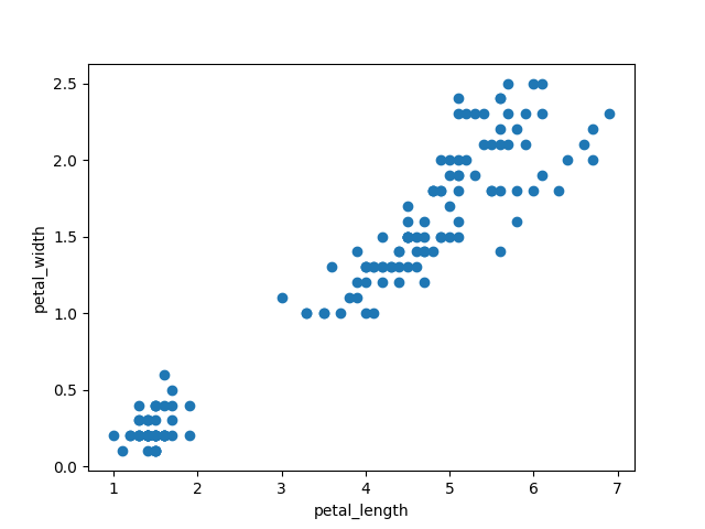
7. Scatter plot
Plotting relation between 2 quantitative variables:
|
1 2 3 4 |
plt.scatter(iris["petal_length"],iris["petal_width"]) plt.xlabel('iris["petal_length"]') plt.ylabel('iris["petal_width"]') plt.show() |
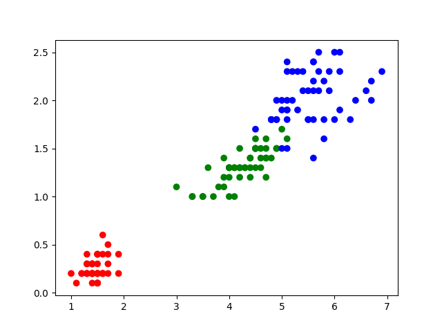
labeling data with colors
|
1 2 3 |
colors={'Iris-setosa':'red','Iris-versicolor':'green','Iris-virginica':'blue'} plt.scatter(iris["petal_length"],iris["petal_width"],c=label.apply(lambda x:colors[x])) plt.show() |
|
1 2 3 |
#plotting scatter plot pd.plotting.scatter_matrix(measurements) plt.show() |
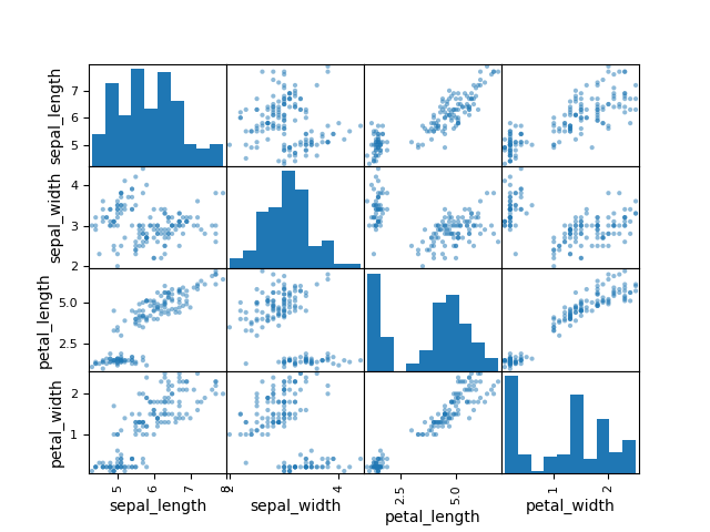
it is a good way to assess any tendencies between 2 variables and to check the distributions of each variables from our dataset.
8. ANOVA : bivariate analysis on mixed variables
let’s try to analyze our iris dataset and compare sepal_length per class of flower.
|
1 |
iris.boxplot(column="sepal_length",by="class") |
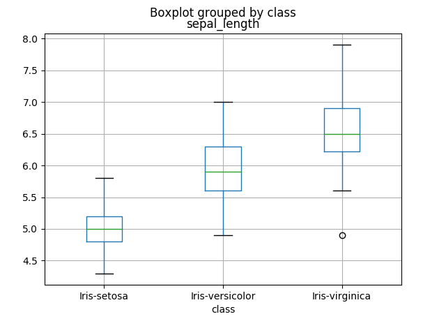
How can we evaluate a correlation between a qualitative and a quantitative variable?
|
1 2 3 4 5 6 7 8 9 10 11 12 13 14 |
def eta_squared(x,y): moyenne_y = y.mean() classes = [] for classe in x.unique(): yi_classe = y[x==classe] classes.append({'ni': len(yi_classe), 'moyenne_classe': yi_classe.mean()}) SCT = sum([(yj-moyenne_y)**2 for yj in y]) SCE = sum([c['ni']*(c['moyenne_classe']-moyenne_y)**2 for c in classes]) return SCE/SCT eta_squared(iris["class"],iris["sepal_length"] #returns #0.6187057307384859 |
9. Chi-2 test
Chi-2 test checks if whether or not 2 variables are related or not. We have the following hypothesis.
H0 : the 2 variables are independent
H1 : the 2 variables are not independent
10. Outliers and missing values
Dataset are not always perfect and frequently presents missing values and inconsistent data.
count missing values
|
1 2 |
df.isnull().sum #return qty of missing values in the dataframe |
If missing values can be found in only a small amount of individual in our dataset, we could simply drop this individuals.
|
1 |
df.dropna() |
remove outliers using quartiles
Outliers is value that appears to be far away and unusual in a given variable or set of individuals. One has to detect and remove them before trying to build a model from data. Their influence is also bad for our statistical estimations. Outliers can be found in a variable, but some individual in our dataset can also be considered as outliers. Before considering any statistical analysis or modeling, we should clean our data from these values.
We usually use our InterQuantile distance to detect outliers
|
1 2 3 4 5 6 7 8 |
#calculate Q1 q1=data['var'].quantile(0.1) #calculate Q3 q3=data['var'].quantile(0.9) #filter out outliers data=data[(data['var']>q1)&(data['var']<q3)] |
missing values imputation
imputing mean or median of the sample is an easy strategy and will have bad impact on modelling
A slightly better approach is to build a simple model with the use of other variables.
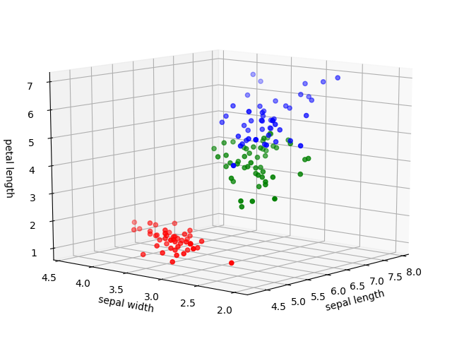
11. 3d scatterplot
|
1 2 3 4 5 6 7 8 9 10 11 12 13 14 15 16 17 18 19 20 21 22 23 |
from mpl_toolkits.mplot3d import Axes3D x=iris["sepal_length"] y=iris["sepal_width"] z=iris["petal_length"] label=iris["class"] #transform label into colors label.unique() #array(['Iris-setosa', 'Iris-versicolor', 'Iris-virginica'], dtype=object) colors={'Iris-setosa':'red','Iris-versicolor':'green','Iris-virginica':'blue'} c=label.apply(lambda x:colors[x]) fig=plt.figure() ax=Axes3D(fig) ax.scatter(x,y,z,c=c) ax.set_xlabel('sepal length') ax.set_ylabel('sepal width') ax.set_zlabel('petal length') plt.show() |
12. Dimensionality reduction
Reduction of the number of features in our dataset is a good option to reduce our computation time when building our model. Nevertheless, we are loosing some information when reducing the space and it should always be made carefully.
a. PCA
|
1 2 |
from sklearn.decomposition import PCA #reducing iris dataset from 4 to 2 dimensions |
disadvantage of PCA : we are loosing the readability of our features (because our data is projected in a brand new space).
b. features selection
13. basic signal processing
see more about time series and signal processing on this page.
autocorrelation
|
1 2 3 4 |
def autocorrelate(x): norm=np.sum(x**2) c=np.correlate(x,x,mode='full')/norm return c |
autocorrelation of a signal helps to find periodicities in a signal.
temporal to frequency : Fast Fourier Transformation
|
1 2 3 4 5 |
#selecting 1 channel of our wav array channel=sample[:,0] T=len(data)/fs fft=fft(channel) frq=np.arange(len(data))/ |
14. Normalizations
Variables in a dataset usually runs on very different range. Normalizations techniques helps to bring every variable to a same range : usually [0,1] or [-1,1]. I’ll introduce the 2 most easy to use and famous type. Please refer to this wikipedia page for more information.
a. standard core
|
1 2 3 4 5 6 7 8 9 10 11 12 13 |
from sklearn import preprocessing X_norm=preprocessing.normalize(measurements) X_norm=pd.DataFrame(X_norm) X_norm.head() #results # 0 1 2 3 #0 0.803773 0.551609 0.220644 0.031521 #1 0.828133 0.507020 0.236609 0.033801 #2 0.805333 0.548312 0.222752 0.034269 #3 0.800030 0.539151 0.260879 0.034784 #4 0.790965 0.569495 0.221470 0.031639 |
b. feature scaling
|
1 2 3 4 5 6 7 8 9 10 11 12 13 |
from sklearn import preprocessing X_scale=preprocessing.scale(measurements) X_scale=pd.DataFrame(X_scale) X_scale.head() #results # 0 1 2 3 #0 -0.900681 1.032057 -1.341272 -1.312977 #1 -1.143017 -0.124958 -1.341272 -1.312977 #2 -1.385353 0.337848 -1.398138 -1.312977 #3 -1.506521 0.106445 -1.284407 -1.312977 #4 -1.021849 1.263460 -1.341272 -1.312977 |
15. Probabilistic distribution models
There are a lot of different models to simulate the behavior of a variable. In the following, I am just going to describe the mostly used. Please refer to this wikipedia page for more insight.
Normal law : a random variable X follows a normal law, we write  . This law is often used to model natural phenomenon. Practically, it’s very common to meet this kind of variable in our datasets.
Bernoulli :
Bernoulli law allows to calculate the probability distribution of a random variable taking the value 1 with probabilty p and 0 with probability q=1-p.
Repeating the experience n times, we want to calculate the probability that
Poisson :
Chi2 : let’s assume a random variable X follows a normal law
We create a new variable Q, such as  , we say that Q follows a Chi2 law
  with 1 degree of freedom
We can invent a new variable  with 2 degrees of freedom
16. Statistic inference : the frequentist and the Bayesian approachs
H0 and H1
H0 is called null hypothesis
H1 is called alternative hypothesis
Significance levels (alpha, beta, type 1 and 2 errors) and p-value
17. Prestudy : run simple machine learning models
Naives and simple models (classification and regression) can be built to replace missing data with predictions values. In some cases, simple models turns out to have very good performance and we won’t really need to pursue our way to much more costly models (in computation an time) such as neural networks.
KNN : K nearest neighbors (classification)
For a better understanding on how this classification algorithm work, please refer to this page. Knn allows to classify an individual regarding his neighbors assuming that individuals with equivalent features belong to the same group. We are choosing the K nearest neighbors of our new individual and associate it to the most common class.
Back to the example of iris flower. Here is the code to implement such a model using scikit-learn library :
|
1 2 3 4 5 6 7 8 9 |
from sklearn import preprocessing,model_selection,neighbors X=preprocessing.normalize(measurements) y=iris["class"] X_train,X_test,y_train,y_test=model_selection.train_test_split(X,y,test_size=0.3) classifier=neighbors.KNeighborsClassifier() classifier.fit(X_train,y_train) accuracy=classifier.score(X_test,y_test) print(accuracy) #100% |
Knn model works really good on this example. Sometimes a simple model can solve our classification task.
Knn algorithms use a lot of computation time when the number of compared features or examples in the dataset is big. We will usually avoid it when this quantities are too big (>1000) and choose an algorithm with better performance.
Linear Regression and R square coefficient of determination (value prediction)
Let’s assume that the sepal length can be approximate by a linear function of sepal_width, petal_length and petal width variable. Let’s model a simple linear model and evaluate its performance.
|
1 2 3 4 5 6 7 8 9 10 11 12 13 |
from sklearn import linear_model,model_selection y=iris["sepal_length"] X=iris.iloc[:,1:4] X_train,X_test, y_train,y_test=model_selection.train_test_split(X,y,test_size=0.3) model=linear_model.LinearRegression() model.fit(X_train,y_train) #Return the coefficient of determination model.score(X_test,y_test) #0.7842461949239874 #make new prediction model.predict(np.array([3,2,1]).reshape(1,-1)) |
Interpretation of R square : R square is between 0 and 1. 0 being the case where the model explain none of the variability of the data around his mean. 1 being the case where the model explains all the variability of the data around his mean. Usually of high value of R square indicates a good model. Nevertheless, this is not a sufficient condition to conclude it with certainty.
Logistic Regression (classification)
|
1 2 3 4 5 6 7 |
from sklearn import linear_model classifier=linear_model.logisticRegression() classifier.fit(X_train,y_train) classifier.score(X_test,y_test) #returns #86.6% of accuracy |
Logistic regression has poor performance regarding this dataset.
Random Forest and Gini function (classification)
|
1 2 3 4 5 6 7 8 |
from sklearn.ensemble import RandomForestClassifier classifier=RandomForestClassifier(n_estimators=10) classifier.fit(X_train,y_train) accuracy=classifier.score(X_test,y_test) print(accuracy) #results #95.5 % of accuracy |
For this case Random Forest Classifier has a slightly lower accuracy than Knn. It’s often a good idea to use different models and compare their performances.
18. feature engineering
to be continued…